Redesigning an edtech company website to increase conversions
Client Project UX/UI Design Responsive WebINTRODUCTIONWho is Sown To Grow?
Sown To Grow is an edtech startup that empowers schools to improve students’ social, emotional, and academic health. Their platform allows students to check in emotionally, set goals, and reflect on their progress. These reflections are then shared with teachers and faculty, which allows them to provide feedback and support to students that need it.
Historically, 95% of their customers have come from marketing emails and word-of-mouth, so updating their public website had been “on the back-burner.” Now that they’ve recently solidified their product-market fit, they want to overhaul their website to appeal to prospective customers.
MY ROLE UX/UI Designer (Contract)
TEAM Dennis Li, Founder & CTO
Julie Dang, Sr. UX/UI Designer
Rupa Gupta, Founder & CEO
Will Bielinski, Product Manager
Willson Mock, Software Engineer
TIMELINEMarch 2022 (3 weeks)
PROBLEM ⚡️Educators are not able to find important or compelling information about the Sown To Grow platform from their website.
The Sown To Grow website does not adequately capture their unique value proposition—their advanced technology, high customer satisfaction, or impressive research studies that show how impactful their product has been on the students they serve. As a result, the company does not get many customer calls from their website—the few that do are often under-informed and not ready to move forward with making a purchase.
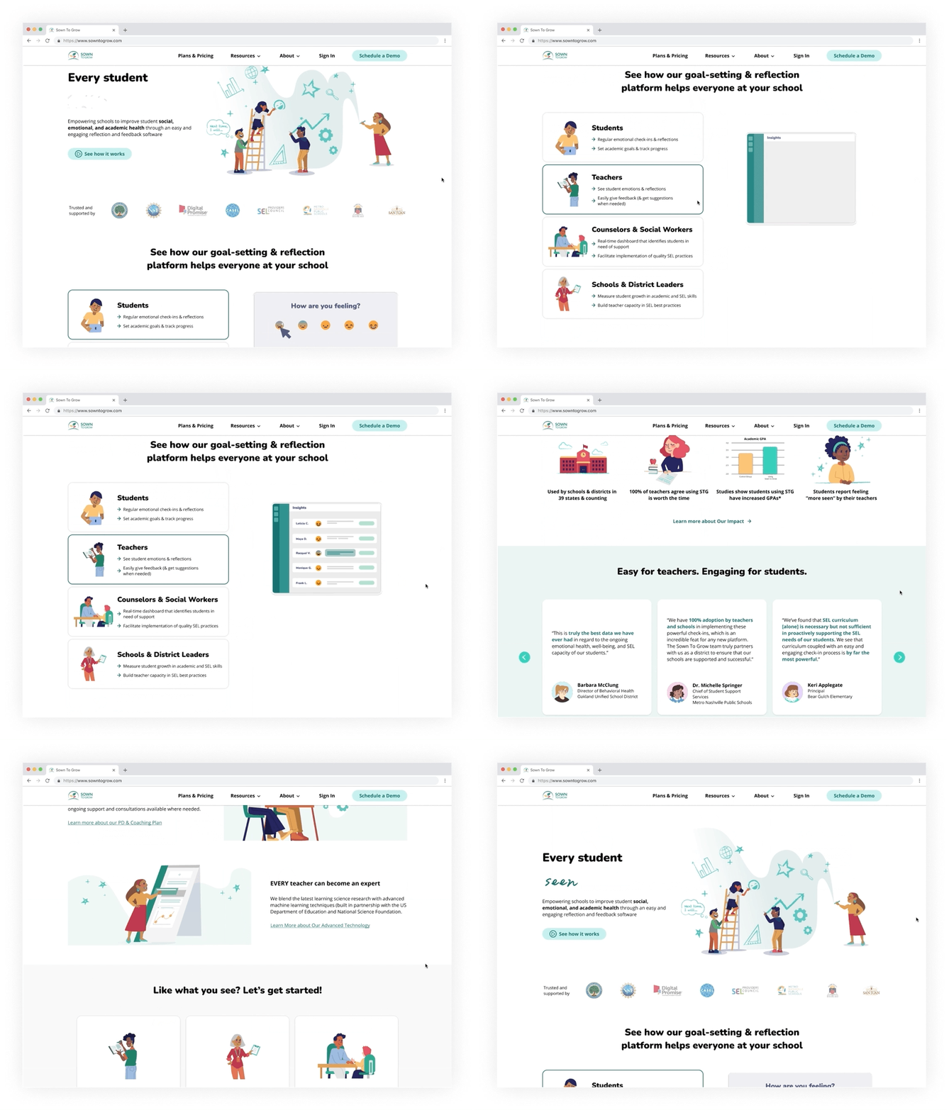
SOLUTIONClear value proposition on the landing page
Within moments of scrolling on the redesigned landing page, prospective customers can immediately see what the Sown To Grow product is, who it benefits, and how positively current customers feel about using the product.
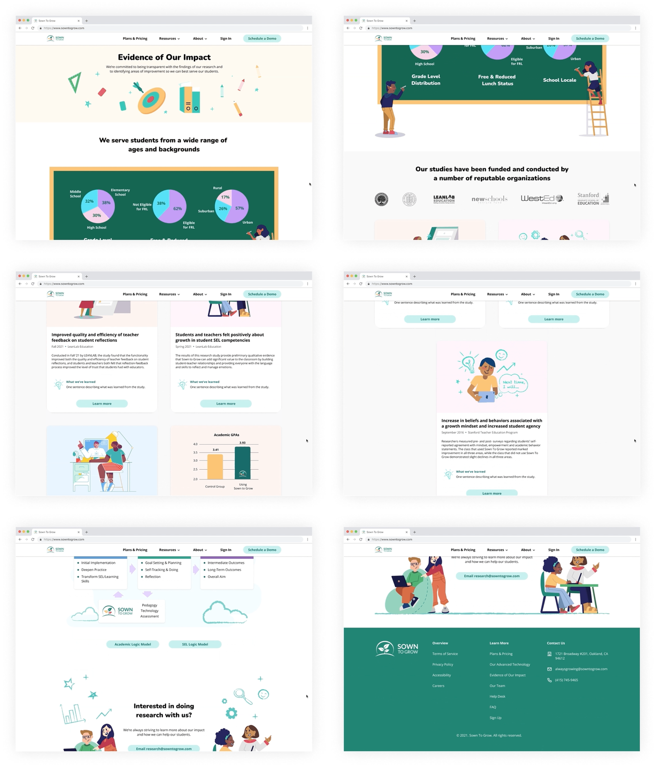
A delightful and informative impact page
The impact page features helpful demographic information and research studies to prove the efficacy of the Sown To Grow product.
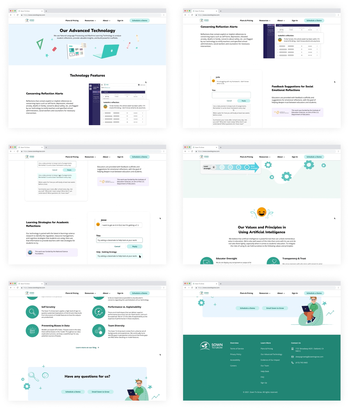
Sown To Grow’s technology, highlighted
The technology page highlights features Sown To Grow’s impressive technology that helps users with problems they see in school. Per user feedback, illustrations and GIFs of the features were added to provide them a sense of what it would look like to use the product.
BUSINESS GOALSUnderstanding Sown To Grow’s goals
I documented the business’ main goals throughout the process—some of which were explicitly expressed during kick-off, and some that were later revealed implicitly in subsequent meetings.
USER RESEARCHUnderstanding the user
I partnered with the other designer, product manager, and sales lead to understand what had been learned about the users already. To further empathize with the users, I also talked to a couple of existing customers to learn about their school’s needs, what they found most important when selecting an SEL program, and their past experiences with SEL.
The primary users of the Sown To Grow website are educators and administrators that are the decision makers for their school or district’s Social and Emotional Learning (SEL) programs.
User Needs:
To find an SEL program that is engaging for students and not too time-consuming for teachers
To understand and measure the social and emotional well-being of their students
To identify and support students who are struggling in real time
DESIGNDesigning with the business in mind
Given the number of interested parties in the redesign—including the founders, product manager, developers, marketing and others—it was important to connect often to ensure the designs met their individual goals. We conducted design reviews following each stage of the redesign, where I would present and get feedback on my designs. The feedback would range from minor visual changes that I could easily fix, to longer discussions affecting content strategy that required additional meetings for alignment.
Throughout the process, these were the design considerations and constraints I had to keep in mind:
🤝 Alignment with stakeholders
Throughout the process, I had to make sure my designs were consistent with other stakeholders’ (often-changing) visions and ideas for these pages.
💭 Predetermined content strategy
As the content was owned and decided by other stakeholders in the company, there was less flexibility in the changes I could make to it (e.g. copy, images, etc.).
⚙️ Technical feasibility
To make things easier for the developers, I stuck to design elements with less interactions and images that wouldn’t increase load time.
💻 Design system
My designs had to follow the current design system and had to make sure that any new assets I created were approved by the senior designer.
TEST + ITERATEAdvocating for the user
As many of Sown To Grow’s team members were former educators and school administrators, usability testing and interviews were not on the original timeline for this project.
However, I had suspected that there was still a disconnect with the user—prospective customers who were unfamiliar with Sown To Grow—both in internal design discussions and in the design itself. Wanting to verify Sown To Grow’s assumptions and the effectiveness of the redesigned pages, I made a case to have usability testing with the team. What we learned from the usability tests turned out to be enormously insightful:
Users had an especially hard time understanding the diagrams and conceptual images Sown To Grow had provided for the Technology page. For the final iteration, I created simplified illustrations of what these features looked like in the Sown To Grow platform.
Users wanted to see more videos, GIFs & screenshots of the product in use.
Technology Page - Before Usability Testing:
Technology Page - After Usability Testing:
Users found the infographic on the Impact page hard to read.
Wanting to preserve the playful chalkboard illustration, I simplified the design by removing the lines, changing the rings to a pie chart, and used larger, bolder fonts for the latest iteration.
Impact Page - Before Usability Testing:
Impact Page - After Usability Testing:
Users found the research study section to take too long to scroll through.
While I could not alter the content or layout too much without compromising the business’s goals of showcasing these research studies, I made the cards vertical rather than horizontal so users can scan two research studies at a time, making it feel as if they’re scrolling less.
Impact Page - Before Usability Testing:
Impact Page -After Usability Testing:
HIGH FIDELITY SCREENSThe Final Solution
Landing Page
Moved the product definition above the fold so users know what the product is right away and know to scroll down
Made the benefits for each role easier to scan, as users tended not to click the different tabs before
Added compelling highlights from and link to the Impact page
Added customer testimonials for social proof
Moved the “Schedule a Demo” button to the top navigation to be easily discoverable on all pages
Added the video icon to the video demo button for greater affordance, as users were not noticing the demo video button
Impact Page
Added a delightful infographic that illustrates the wide range of students they serve
Called out the organizations that users respect and that have partnered with the company
Showcased the research studies in cards that emphasize the company’s dedication to learning
Made the style consistent with the rest of the website to establish legitimacy and gain user trust
Technology Page
Highlighted the latest technology features that helps users with problems they see in school
Added simplified illustrations of what the features look like in use, per user feedback
Removed technical jargon and content that felt intimidating to users
MOVING FORWARDDeveloper Hand-Off
At the end of the project, I handed off my design blueprints to the developers and walked them through the interactions and responsive behavior. The designs won’t be shipped for another few months, until after the entire website redesign is complete.
UX Recommendations
As Sown To Grow is just now getting started with Phase 2 of the redesign, I presented to Sown To Grow my UX recommendations and findings from my research:
📢 Alternative CTA
Some users find it burdensome to schedule a demo - consider adding alternative options that allow users to get their questions answered (e.g. updating the FAQ page, highlighting the email option, etc.)
🧐 Research participant selection
When sourcing research participants for the website redesign, select participants with no connection to or prior knowledge of Sown To Grow get unbiased (and most useful) feedback.
🙉 Show, not tell
Users have mentioned that they want more videos, GIFs and screenshots of the product in action prior to scheduling a demo, and that they prefer not to read long text.
📝 UX writing
When writing copy, keep the language concise and conversational, and be mindful when using business/technical jargon.
REFLECTIONBalancing business and user needs
The biggest challenge I faced in this project was balancing the business’s needs and user’s needs. In a small startup with an even smaller design team, user research was understandably limited. While that might not always be problematic, I did notice that in this case, there was a disconnect with the users—both in internal design discussions and in the website design itself. So while usability testing and user interviews were not on the original timeline for my project with STG, it was something I knew I had to push for.
In the end, the insights we had gleaned from the user research I initiated was not only helpful to the work I did on the redesign, but eye-opening for the company as a whole. Because of this, they’ve told me that they are planning to incorporate more user research going forward, especially as they continue the website redesign.


